OUR 60 SECOND WORKFLOW ON AUTOMOTIVE PHOTOS
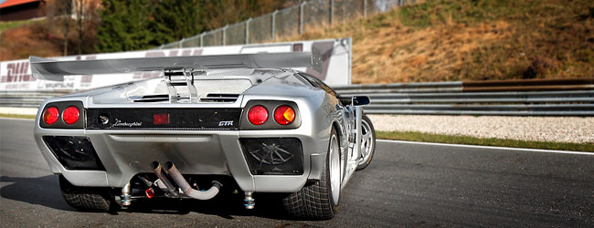
Canon EOS 350D - Canon EF-S17-85mm f/4.0-5.6 IS USM - 17mm 1/1600 f5.0 ISO 200
Intermediate level tutorial by Mark
Once you get the hang of it a workflow like the one presented on this page will only take you about 60 seconds to complete, but makes all the difference when you want to show your photographs.
Before/After comparison

Take a look at this image, the left side shows the original shot as it was made on the Salzburg Ring in Austria, it wasn't too bad, but with a little bit of work you see what we could make of it as seen on the right ... and the best thing is that it will take less than 60 seconds to complete once you get experienced in this simple workflow.
As always we use Adobe PhotoShop for this workflow, in our opinion one of the best photo editing software available at this moment. Granted, it isn't cheap, but do buy it as part of your automotive photography gear, you will not regret it. There are other software titles out there that can probably perform the same manipulations as we will show you here, you are free to try other solutions, but for now we will stay with Adobe PhotoShop for our work.
Getting started
First things first, start by opening your raw file using the ACR (Adobe Camera Raw) supplied with PhotoShop (in case you work in JPG, don't worry, you can skip this step) and make sure you get the white balance corrected as close as possible. You can also use the RAW converter that was delivered with your camera if you are more comfortable using it, the point of this exercice is to get the image into Adobe PhotoShop, how you get to that point is not so important.
The original as it was loaded in to PhotoShop :

STEP 1 : Sharpening
 Just about every image we load into PhotoShop will need a bit of sharpening to make it just right, we use the UnSharpMask (USM) for this that can be found in the 'Filter' menu under the 'Sharpen' entry.
A safe bet would be to perform this sharpening on a new layer in fact, so if you like you can select the entire image (Ctrl-A on PC/Cmd-A on Mac) and copy the image alltogether (Ctrl-C on PC/Cmd-C on Mac), after this just paste the exact same image onto this one (Ctrl-V/Cmd-V) and you'll end up with a new layer holding an exact copy of the original photograph. If you ruin the image now with the sharpen filter you can always delete this layer and perform the steps above again to start from scratch. (Another quick step would be to use Ctrl-J/Cmd-J on the background layer, this will give you the same result as doing a copy/paste)

We tend to use a rather mild setting for this option, you can always perform the sharpening step again if the effect was not sufficient, but it is better not to exagerate with this option, hence we use the following settings : Amount 50%, Radius 1,0 pixels and Threshold at 1 levels. You can naturally play around with these settings, but we've come to use these as a standard in our workflow.
STEP 2 : Levels
A rather important step that will suddenly make your image look a lot better if performed correctly, the Levels adjustment, which can be found under the 'Image' menu, 'Adjustments' entry and 'Levels', it is the top item in this sub-menu and can also be reached by using the Ctrl-L/Cmd-L shortcut.

Now this can be a very intimidating screen, but actually it is quite easy to use if you remember a few basics about it, we'll go over the steps we use it for in detail. You will notice that we've added a few numbers to the screenshot, these are meant to guide you further, for instance the *1 actually represents the slider to adjust the shadows in your picture, the *2 is a gamma slider while the *3 slider alters the highlights for the image.
The graph above these sliders is actually the histogram of your image which you can also display on your camera's LCD after taking the shot, PhotoShop allows you to modify the shadows in the image by moving the *1 slider to the right, in this particular image this is not needed, but you can try it to see what happens anyway. Same thing for the *3 slider, but now you are changing the highlights, again not required in this instance, but try anyway. Just don't forget to put them back in their original place after you are done playing around, the *2 slider is more interesting right now, it allows you to darken or lighten the overall image by modifying the gamma for the image, it can make your colors more intense in a second, try moving it to the right to see what we mean here ... we occasionally use this one to put some more punch in a shot, but use it with care, this is yet another option that quickly goes over the top.
We like to use the eyedroppers to get the image right, the *4 selects the shadows (or the blacks in the picture) while the *5 is used to pinpoint the highlights, or the white to put it simple :

What we tend to do is use the the shadow eyedropper and look for something that should be black in your image, which happens to be just above the exhausts in this specific shot.

Afterwards we do the same but for the highlights, in this particular shot the white board behind the car looks like a nice option to put as highlights for the image, on this photograph you will only see a slight modification of the white balance, the image gets a bit warmer so to speak. It was shot with a rather complete histogram, but in case you are missing parts to the left or the right of the histogram you will see a major difference after performing these simple steps.
As you might imagine it took a lot longer to explain than to actually perform this step, try this on some of your own images to get a feel of what you can achieve with this simple step.
STEP 3 : Saturation
We like our photographs to carry some punch, and one way to achieve that is to increase the saturation a bit to intensify the colors, you can perform this step on particular colors only, for instance the reds to make the taillights stand out better, or the greens to make the grass look better, however we will use it on the master :

Again there is no need to exagerate this step, as you can see we work with a value of +10 in saturation, this is enough to give your colors some more intensity, using values of 20 or more would give the photograph an articicial look, however feel free to experiment with this setting. For our taste the +10 value was enough on this image.
At this point your photograph should already look a lot better than when you've first opened it in PhotoShop, however we are not yet finished, our 60 seconds aren't used yet, so we will continue with yet another nice step to improve your skills and put your images to a higher level, turn to page 2 of this tutorial ...
The result so far wasn't bad, but as we were forced to use a wide angle lens on this shot due to restrictions in space we didn't have a nicely blurred background, let's remedy this with a few simple steps in PhotoShop ...
STEP 4 : Background blur
When you have enough room you can use a telephoto lens to shoot the car, this will created a nicely blurred background and have the car really stand free from the surroundings, but you do not always have this option. In this particular shot we were forced to work up close and personal to the car. Hence a 17mm focal length was imposed so we had to give up any hopes of getting a nicely out of focus background. However we can achieve about the same results in PhotoShop, and here's how :
Duplicate the layer you were working on in the previous steps (not the background layer, as this is your backup of the original image) by using Ctrl-J/Cmd-J or go to the 'Layer' menu and select the 'Duplicate Layer' entry. You should have three layers in your image now, Background all the way at the bottom, Layer 1 on top of the background and a new Layer 1 copy at the top. If you do not see the layers press F7 on your keyboard or go to the 'Window' menu and select the 'Layers' entry.
 Make sure that the Layer 1 copy is selected, then go to the 'Filters' menu, select the 'Blur' entry and find the 'Lens Blur ...' option, that's the one we will be using at this moment.
We use a rather simple setting for this, it all depends on what look you would like to get, remember that too much will give away the fact that it is artificial, so moderation is needed once again.
Our settings are 'Layer Mask' for the source and a Blur Focal Distance of 61, which works best for this image, this latter value depends on the picture itself, so you'll have to experiment with it on your own photos. For the shape we use either 'Hexagon' or 'Octagon', both give a nice out of focus blur effect, a radius of 15 is just right here so let's hit OK.

Oops, the image doesn't look to good anymore, but that is only temporarily, we will fix this now. What you need to decide now is which parts of the image would be in tack sharp and which parts would be out of focus if you could have used a long telephoto lens. Naturally we want to have our car in focus and the background out of focus, perhaps even a little bit of the track in front of the car could be blurred too, so let us show you how this is done : it requires a mask in PhotoShop.
STEP 5 : Adding a Mask
 This is easy, if you take a look at the bottom of the layers window you will notice a rectangle with a cirle in it, right next to the fx button, this is the 'Add vector mask' option, it will create a mask using the layer that was currently selected (being Layer 1 copy in our case), you can also use the 'Layer' menu, 'Layer Mask' option and use the 'Reveal all' entry (the Vector Mask is also possible here), you will see a white rectable appear next to the thumbnail in the Layers window, indicating there is a mask on top of that specific layer.
Now we can simply determine what is blurred and what is tack sharp by using black and white brushes on this layer mask, white shows this layer, black will show the underlying layer (our sharp version), it is as simple as that !

You should draw black all over the picture in the areas you would like to see sharp, remember that a background blur doesn't happen from one pixel to the next, so you will be using a 'feathered' brush here, one that gives a nice fade out aspect on the gravel in the background of this shot, naturally the car itself should be sharp right up to the edges, so here we will use a 'hard' brush.
In the end you should get something like the image above (we've made our mask red to give a better impression of what we 'painted'), a nice tack sharp car and a good looking, blurry background, also note the display in the 'Layers' window, it should look similar for your own pictures. Drawing such a mask takes a bit of getting used to, we use a tablet for this as it works more logical compared to a mouse, but the latter should get the job done as well.
In case you de-selected the masked layer and would like to continue drawing on it later on make sure to select the mask, if you select the layer you will draw plain white or black, only when you select the mask at the right will you determine what is visible and what is removed from the mask
STEP 6 : The final touches
We are nearly there, it is time for the final touches which will draw the viewer's attention even more to the car that now by adding a vignette. This will make the surroundings look darker and automatically make to onlooker focus on the lighter part of the shot, being the car in our case, just what we wanted to achieve.
If you do this correctly it will also make the sky a more intense shade of blue, something like a polarising effect without using a special filter and we can make areas lighter if they would appear too dark in the shot, something like a dodge and burn effect from the good old days of film photography.
This step involves creating yet another new layer, you should know how to do this by now (Layer > New > Layer ... or Shift-Ctrl-N/Shift-Cmd-N) but the trick is to set it's blending mode to either 'Overlay' or Soft Light' as shown in this image. Click the drop-down next to 'Normal' and select the option 'Soft Light' ... you won't see any difference yet, but we'll deal with that now.

 Now it's time to select a gradient fill from the tools by clicking and holding the paint bucket, you'll receive a menu with two options, Gradient Tool and Paint Bucket Tool, select the upper one, Gradient Tool.
 Hit the 'D' key on your keyboard, this will reset the foreground and background colors to black and white respectively, which is exactly what we need here, after that use the Gradient drop down at the top of the screen to select a 'Foreground to transparent' gradient fill. Click the *1 drop down and select the second gradient type to the right starting from the top left (*2 in the image), this will activate the black to transparent gradient we will use now.
Now we'll perform one of the neatest tricks in PhotoShop to improve your images, position your cursor slightly above the top of the car, hold down the Shift key and while holding down your mouse button draw a straight line towards the middle of the car like we show below :

You immediately notice the sky and the grass becomes more intense, this is what the Soft Light blending mode achieves, when using black it intensifies the colors, when painting in white it will make the colors lighter, a kind of dodge and burn effect from the old days of film.
We're not done yet, now we will draw a similar gradient from the bottom of the image upwards to the car and from each corner in the direction of the car, much like the image below :

You notice that the color surrounding the car gets more intense, or darker if you like, this automatically draws the attention of the viewer even further towards the car, but there are still a few details we would like to enhance, take a look at the image below, we don't like the harsh highlight next to the taillight, so we will paint a bit of black on the Soft Light layer over this to darken it. The fans at the rear could be made more visible, for this we will paint white over them on the same layer, this will increase their visibility. One last thing is the road and gravel to the left of the car, it is too light compared to the same material at the right, so we'll use a feathered brush to paint black over those parts as well, remember we are always working on the Soft Light layer here !

After you are done with these steps your Soft Light layer should look something like the one in our screen shot below, notice there is a lot of black on this layer to darken the colors, the image is now nearly finished ...

The final touch we added to this image was to add a second Soft Light layer with a black gradient from top to bottom but with the opacity set at only 50% to further intensify the sky in this shot, but that was particular to this image, normally one Soft Light layer is all that it takes. Because we felt the red text in the background drew attention we desaturated it too, but again this is only valid on this shot, check out the final result here :

Once you get a bit more experienced in this you will be able to complete this entire workflow in 60 seconds or less, which means you will improve your images with only a minute of work, select a shot you really like and try this workflow on it, you'll see that it really does work wonders and will surely give your shots the edge they deserve.
If you feel that the intense colors are too much you can always decrease the opacity of the Soft Light layer, this will make the image appear brighter, experiment with the layer opacity, it is really useful in your workflow. (Layer opacity is located next to the blending mode, to the right of the 'Soft Light' text at the top left of the Layers window in our case)
 |
CPT Premium member BONUS : 58422 If you would like to print the 60 Second workflow tutorial you can download our special PDF which is optimized for hardcopy layout. We even included the PSD file used in the tutorial. |
Note : commercial use or publishing of our tutorials in any way, written or electronic, is strictly forbidden, we present these for your personal development only. None of our material may be published in any way without prior, written permission from the Car Photography Tutorials founder. All workflows and photographs are copyright protected and owned by the Car Photography Tutorials team unless stated otherwise
Advertisement
Become a MEMBER
Premium Membership
Become a CPT Premium Member and download all our tutorials including a PDF for printing and the result as a PSD file with layers if any.
Interesting articles

Off camera flash car photography, part 1 of 2 : the shopping list
In this first part of the off camera flash tutorial I take you over the required equipment to get started using additional light sources.

Case study - deTomaso Pantera
I take a reasonably good shot and put it through some extensive post processing to create a photograph

Common mistakes when shooting a car
We all made these mistakes at first, but after gathering some more experience we could pinpoint these mistakes and share them with you so you can avoid them.

Using actions to add a watermark to your photos
We show you a way to add a custom watermark to all your photos, no matter if they are in landscape or in portrait orientation using actions that require no manual intervention.
Buying a tripod for car photography
A lot has been going on about tripods, do you really need one when your main objective is to photograph cars ? We go over the advantages and the problems and help you to select the best one.
Keep up with CarPhotoTutorials
Why not follow us, become a fan, get our RSS feed or mail a link to a friend ?
![]()
![]()
![]()