OUR TOP 10 TIPS FOR POST PROCESSING USING PHOTOSHOP
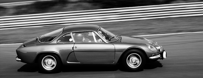
Canon EOS40D - Canon EF 24-105mm f/4.0 L IS USM - 35mm 1/125 f11.0 ISO100
Basic level tutorial by Mark
Tip 1 : Quick White Balance repair
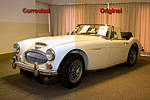 It happens to all of us, we start photographing a car only to discover we've left the camera at JPG format instead of RAW and naturally the white balance is wrong ... fear not, we have a neat little trick that will most likely solve this issue quickly and easily.
Open the image in Adobe PhotoShop and open the 'Levels' toolbox (press Ctrl/Command-L), you will get a box with three color pickers at the right, one for black, one for gray and one for white ... these three will allow you to quickly adjust the white balance of the image you've opened.
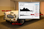 Select the left one and locate something in your shot you think should be completely black ... click this area (take care to click the correct pixels, you can zoom in to facilitate this), afterwards select the right color picker and locate something you think should be white (or very light gray) and click that area ... your image will use these two values to put the corrected white balance in place.
It doesn't always work, but it is surely better than having a totally wrong White Balance, by the way, if you see something that should be neutral gray in your photograph you can use the middle color picker to select that area, this way you'll have three shades to determine your final White Balance setting.
Tip 2 : A nice sky in 10 seconds
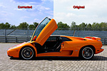 We don't all live in sunny Italy or California, when we get lucky the sky is blue during the summer, but most of the time it will be blown out to a very light blue ... don't worry, we have a perfect solution for this that will give you a nice Italian blue sky in no time.
Open the original image (RAW or JPG) in PhotoShop and add a new layer on top of the background (Layer > New > Layer ...) but don't click 'OK' yet, change the Blending mode (found at the lower left corner of the dialog box) into 'Overlay', than click 'OK' (don't worry about the name of this new layer, it is of no importance at this moment).
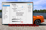 Now the trick, select the gradient tool and make it a 'foreground to transparent' one and make the foreground color totally blue (#0000FF), now click at the top of your image and draw down to where you think the horizon should be in your shot ... you will see your sky turn blue at once.
Problem is that your car and other parts in the image are blue now as well, so we will change the blending of the layer, double click on the 'blue layer' and you will get a dialog box, now slide the lower slider to the left until you like the result, if there are still parts of the image blue that you don't want to, just use the eraser on those sections without touching the sky.
Tip 3 : Over exposed ? No problem
It can happen to the best of us, we're in a hurry during a car show and we've left the camera on manual after shooting a light shade car when we quickly grab another shot ... and it is over exposed and we've missed the opportunity to take a second shot.
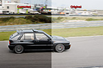 Don't worry, we can solve this in post processing very quickly, when you've remembered to shoot in raw you can just dial in a negative exposure when developing the shot, however if you've mistakenly took the shot in JPG you will need to rectify the problem in your editing software.
As always open your photograph in PhotoShop, now create a new layer again (Layer > New > Layer) and change the Blending mode in the dialog box to 'Overlay', then click 'OK'. Press 'D' to set the foreground color to black (and the background color to white) and select the Paint Bucket tool to fill the entire layer with black, this will create a kind of under exposure on your image.
If the effect it too much just lower the opacity of the layer, if it isn't strong enough you can duplicate the layer by pressing Ctrl/Command-J and lower the opacity of this second 'Overlay' layer if needed.
Tip 4 : Image too dark ? Fear not ...
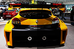 The opposite of over exposure can happen too naturally, and solving this issue is very similar : open the image in PhotoShop and again create a new layer (Layer > New > Layer ...) and set the blending mode to 'Overlay'.
Press 'D' on your keyboard to set the foreground and background color to black and white respectively, but now press 'X' to put white up front and black at the rear ... fill the new 'Overlay' layer with white using the Paint Bucket tool (press 'G' on the keyboard) and you will see you image get lighter instantaneously.
As usual if the effect is too much lower the opacity of this layer, not enough than duplicate the entire layer to increase the effect, just take care not to overdo it, effects like this quickly look 'artificial'.
Tip 5 : Exposure compensation on JPG
The two previous tips work nicely, however sometimes you would really like to apply some real exposure correction to your JPG file, just as you would when developing RAW files ... and it can be done by layers (as usual).
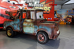 Open your image in PhotoShop and duplicate the background layer (either Copy/Paste the entire background or use 'Duplicate layer' from the Layer menu), now change the by now well known 'Blending mode' of this new layer to Multiply and lower the opacity to 40% ... this will effectively under expose the original image by one full stop !
If you want to work with half stop compensation just put the opacity of the layer at 20%. If the darker image looks too dark in some areas just use the eraser to 'remove' those sections from the upper layer to reveal the underlying, lighter areas (normally we would use a mask for this, but that isn't a basic level edit, so for now just erase it).
Tip 6 : Dull looking colors ?
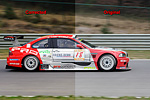 Sometimes we get rather dull looking colors, this can be due to weather circumstances or from using less than ideal settings on our camera, however we present you with a quick tip to make them really pop again.
We start by opening the image and than getting to the 'Levels' dialog box (by clicking Ctrl/Command-L) just like in the White Balance tip, however here we will take a look at the histogram shown, if you see that the left or right doesn't have any levels we move the pointers. Let's say that the left pointer is offset to where the 'white' begins, just grab the pointer with the mouse and drag it to the left until it starts to touch the color, you will see the image change on screen.
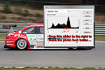 Do the same when the left pointer isn't touching the levels, drag it the right until the image looks right ... now for the fun part, if you want to increase the contrast in your image get hold of the middle pointer and drag that one to the left or right depending on how you want your shot to look, always keep an eye on the image and try not to make it look artificial.
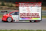 Click 'OK' when you feel the contrast is correct, now it's time to bring out the color, press Ctrl/Command-U to bring up the Hue/Saturation dialog box and locate the 'Saturation' slider (it is the middle one below Hue and above Lightness.
Putting a positive value in the Saturation box will increase the color saturation in your image, making it 'pop' more, lowering this value (putting in negative values) will remove color from your shot (put it all the way to the left and you'll end up with a kind of black and white image), you can also drag the saturation slider naturally, to the left to remove color, to the right to increase the color.
Tip 7 : Easy sharpening
Most of the time we would stick to the USM (or UnSharpMask) method found in PhotoShop to perform any kind of sharpening on images, however getting the settings right could be a nightmare if you are just starting out, therefore we present a much easier way for you ...
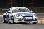 Open your image in PhotoShop and select the entire image (Ctrl/Command-A), then copy it and immediately paste it again (Ctrl/Command-C and Ctrl/Command-V) so you end up with a new layer on top of your image which actually holds an exact copy of the underlying background.
Now go to the 'Filter' menu and perform a 'HighPass' on this new layer (Filter > Other > HighPass ...), just leave the radius at 5 pixels on this dialog box and press 'OK'. Granted the result will look strange, but here's the trick, change the 'Blending mode' for this layer to 'Overlay' in the drop down box ... and you will have an ultra sharp looking image ...
Most likely too sharp and artificial looking, but you already know how to solve this if you've red the above tips ... just lower the opacity of the layer until you are happy with the sharpness in the image, do a 'Flatten' now (Layer > Flatten Image) and you will again have a single layer photograph, but much better looking now.
Tip 8 : Quick Black and White
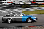 Create a black and white version of your image without actually removing any color from it ... sounds strange ? Trust us, it isn't. All you have to do is work with a 'Fill' layer, which is naturally found in the Layer menu.
We will start by putting a gray look over the color image by creating a new 'color' layer (Layer > New Fill Layer > Solid color), in this dialog box you should change the 'Blending mode' to 'Color' in the drop down bow, after clicking 'OK' you will have to select a shade to fill this new layer with, we would suggest leaving it at #FFFFFF or #000000 (as long as you remain in neutral shades the effect stays the same).
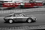 You now have a nice gray shaded version of your color photograph, the only thing that remains is to change the overall contrast and brightness ... which we will again do with a new layer so we do not touch the original image.
We again create a new layer, this time an adjustment layer (Layer > New Adjustment Layer > Brightness/Contrast), in the next dialog box make sure the 'Preview' option is selected and start sliding the Brightness and Contrast gliders to the left or right depending on your shot, you will see the effect on your image as the 'Preview' option is active ... when you are happy with the looks, click 'OK' and there you have it : a nice Black and White version of your image.
Tip 9 : Dodge and Burn
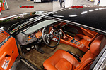 Sounds complicated ? You may never have heard about this before, but it is a technique often used by photographers when developing actual film (in the good old days), however we will show you a quick way to do it in post processing, without even touching the original image.
The basics are the same as for our third and fourth tip, start by opening your image in PhotoShop and put a new layer on top of it (Layer > New > Layer ...), but before hitting the 'OK' button we change the 'Blending Mode' to 'Overlay'.
Now hit the 'D' key to get the colors right, black up front, white at the back, select a brush (not a pencil) and make it a nice size (make sure it is a soft brush) and start drawing black over those areas you feel are too light in the shot ... they will magically get darker.
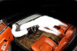 The same works for areas that are too dark, just hit the 'X' key to make white your painting color and draw your soft brush over the dark areas ... they will light up at once. This is the trick of dodge and burn in a non-destructive way.
As you are working on a layer and not on the original image you can get away with mistakes, if you've painted too much, just use the eraser to remove it again, the underlying, original image will come up again so you can paint over it again with a smaller brush for instance.
Tip 10 : Get it straight
Sometimes you only notice this when you look at the image on your computer, you didn't get the horizon straight and now it seems that the car is on a slope ... doesn't work in your photograph, however fixing it is very easy.
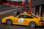 As always open the image in PhotoShop, now make the 'Rulers' visible (press Ctrl/Command-R to show them), position your mouse in the top ruler and click here, hold the mouse and draw downwards, you will see a guide line appearing, position that one in the area of the horizon on your photograph, you can also draw a guide line from the left ruler if you have a vertical reference point like the wall in this Porsche image.
Now select the entire image (Ctrl/Command-A) and transform it by pressing Ctrl/Command-T, you will see several handles appear around your image, the ones on the corners are what we will be using, position your mouse close to one of these and the cursor will change in to arrows around a curve, now click and drag and you will see your image rotate freely on the canvas.
With the guide line in place you can position your horizon perfectly straight now, just release the mouse button when you are there and press 'Enter' to apply the rotation and you will have a perfectly straight image, now just crop away the corners to remove those parts where the background color became visible and you are done.
Bottom line
These 10 tips should help you when you are facing a problem with your automotive photography, most of the time a little post processing can make the difference between a good photograph and a great one.
 The trick with post processing is not to go over the top, you can easily ruin a good photograph by having too much processing done to it, there is a thin line between good enough and too much.
All of our photographs have some kind of post processing done to it, just about every image you will encounter will have been worked on, there is no magazine and very few websites that actually publish images straight out of the camera, so why shouldn't you make your shots look better by applying some of the above tips ?
It will take some time and experience to use these tips correctly, but just go ahead and try some of them on your images, you will see that in time you will be able to judge when enough is enough ... and a lot quicker than you might imagine, all it takes is a little effort.
 |
CPT Premium member BONUS : 113428 If you would like to print our TOP 10 tips for post processing using PhotoShop article you can download our special PDF which is optimized for hardcopy layout. |
Note : commercial use or publishing of our tutorials in any way, written or electronic, is strictly forbidden, we present these for your personal development only. None of our material may be published in any way without prior, written permission from the Car Photography Tutorials founder. All workflows and photographs are copyright protected and owned by the Car Photography Tutorials team unless stated otherwise
Advertisement
Become a MEMBER
Premium Membership
Become a CPT Premium Member and download all our tutorials including a PDF for printing and the result as a PSD file with layers if any.
Interesting articles
Post processing automotive event photographs
We all know the drill, we’ve been to a car show or outdoor event and we’ve encountered some amazing cars but our shots have bad backgrounds so we'll have to revert to post processing to get it right.
Case study - DOF, Depth of Field
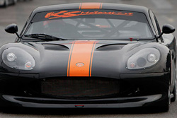
This shot was taken while the black Ginetta was leaving the pit lane at a famous circuit in Belgium, it looked good straight out of the camera, but a little bit of tweaking made it perfect.
Do I need a fistful of dollars ?
We get this question on a regular basis : how much do I have to invest to get started as a car photographer ? We explain our vision in this article : don't go for the cheapest way but get it right from the start.
Action photography using a car rig with suction cups
Suction caps are commonly used to attach a boom onto a car so you can position a camera at a fixed point from the car and take a photograph while the car is moving to create impressive action shots.
Case study - Countach
In this specific case study we will take a look at how to remove unwanted clutter from the backdrop of a shot.
